
The Salesforce Lightning Design System (SLDS) v2 finally dropped in my latest scratch org, and I’m not impressed.
At first glance, things look more modern. However being UX certified, I noticed several issues that may negatively impact users. Let’s examine page layouts.
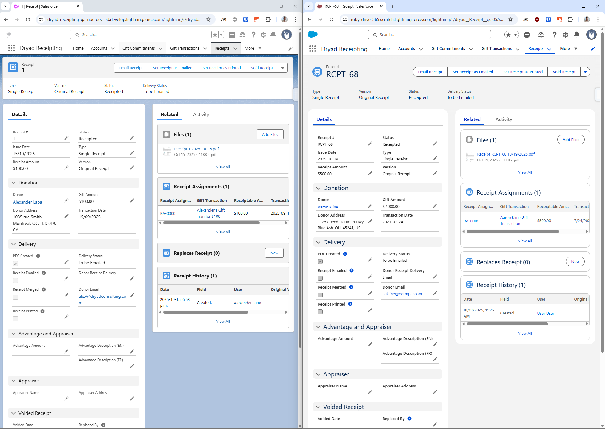
On the left is SLDS v1 for a Receipt object and on the right is v2.
- In the details panel, all the field labels are bolded. This unnecessarily increases the contrast and increases your eye’s stress level.
- Checkboxes are darker, which also makes them unnecessarily more noticeable.
- The helptext icon are dark blue, which also makes them unnecessarily more noticeable. They almost look like clickable buttons.
- The compact layout, which is supposed to display the most important fields, is now barely noticeable, as it fades into the background.
- In related lists, the titles use a white background, which causes your eye to notice them less.
- In related lists, fields are lighter than everywhere else on the page.
- You can no longer change the background colour using themes. You’re stuck with this light grey one.
The takeaway
While SLDS does bring a modern look, it introduces more noise, more contrast, and less options to customize your experience.
Category:
Salesforce