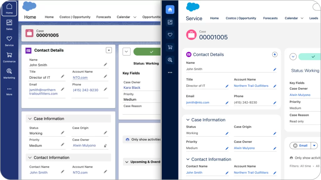
Coming soon to a Salesforce instance near you, the updated Lightning UI.
There seems to be a general trend at Salesforce that’s heading in the direction of a better overall user experience. In a recent meeting, they spoke about making the administrator’s experience less painful.
Now an updated front-end experience is imminent. Combined, this is exciting news!
Here’s a future peek at what we are getting (before and after the update):

They based design decisions on these five criteria:
- Seamless: has no awkward transitions, interruptions, or disparities; and is connected and unified.
- Responsive: is quick to respond or react appropriately.
- Intuitive: is easy to learn, understand, and navigate without explicit instruction.
- Trusted: is reliable and stable, which ensures the user feels supported and guided.
- Delightful: is appealing, rewarding, and sparks joy.
The result should have
- Improved organization and harmony
- Clear indicators of success and prioritization
- Improved performance and load times
- Improved approachability and accessibility
In terms of rollout, new instances of Sales Cloud Enterprise Edition will have the new UI starting July 25, 2024. Existing instances will be updated throughout the year.
Hopefully we’ll have sufficient notice to warn our clients in advance.
The takeaway
As a certified UX specialist, I’m optimistic about these design changes. I hope they help adoption and simplify user training.
