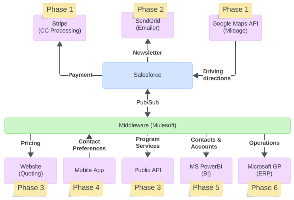
Looking beyond the borders of Salesforce, a system architecture diagram helps understand Salesforce’s place in the project.
Just like user flows, it’s always a good idea to have a current state and desired future state for system architecture. The future state might be a phased approach, with different integrations introduced in later phases.
Here is the basic arrangement
- Each box represents a system, with Salesforce usually at the center of the diagram
- Lines show the direction of data flow. If you’re sending data to another system, the line starts at Salesforce and ends at that system
- Each line is labelled with the type of information passed
- If a middleware is included for some integrations, indicated which connections use the middleware and which ones are directly connected to Salesforce.
- Colors can be used to distinguish the type of system: Salesforce, middleware, 3rd party system, etc.
- If you have a phased delivery, sticky notes can be used to identify in which phase the system will be introduced
Put together, it looks like this

The takeaway
Once again, don’t overly populate your system architecture diagram. For example, if you use a middleware for all connections, then don’t bother including it in the diagram. The goal is to be clean, valuable, and accurate.
Category:
Salesforce 